Colour Analysis: How to Wear Your Beautiful Essence Colours
Sep 22, 2022
Your clothing colour can either compliment or ruin your look. Have you ever noticed how colour affects your appearance and how people perceive you? Has it ever crossed your mind how your certain colour of choice in clothing makes you look tired and listless? And have you noticed on certain days, you look gorgeous, stunning and energised?
Well, you might not have considered this, but the colour theory has to do with these! The wrong colours can negatively affect your appearance. If you want to consistently look your best self and shine with positivity, choose the right colours to flatter you, and that’s exactly what I’m sharing in today’s post.
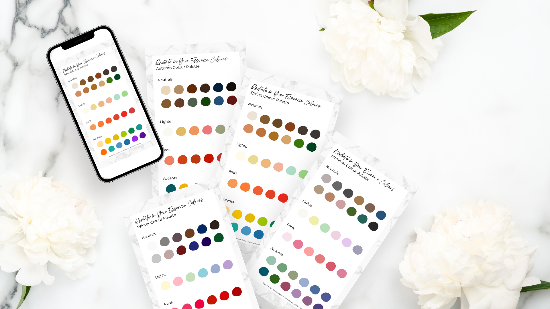
Before we get started, I want to let you know that I've created 4 seasonal colour swatches, each containing 36 hues to help you identify your essence colours and wear these colours to look beautiful instantly. You may click here to download these swatches for free.
What Is Colour Analysis?
Do you feel uninspired and less interested in the outfits you have in your wardrobe? Do you take a lot of time choosing what clothes to wear and can’t seem to find the right match for you? I feel you. This is one of the primary concerns of my clients who feel unhappy about their clothing staples.
Let me introduce you to colour analysis, a helpful tool to help you determine the right colours that will make you feel and look your best – the colours that will flatter and highlight your best assets.
Depending on your appearance (hair, skin, and eye colour), your imaging consultant will assign you the colour palette and combination to work with your natural colour.

If you haven’t heard of this concept, it basically involves performing colour analysis.
Again, the result will be based on the natural colour of your eyes, skin, and hair. Using it will be beneficial, time-saving, and appearance-flattering because it will allow you to make sets and sets of outfit staples that can make you awesome all the time.
What Makes A Harmonious Clothing Colour?
It successfully emphasises your natural colouring and enhances your hair, eyes, and skin. You’ll notice that you look great on it and that you don’t need to put on a lot of makeup at all.
No wonder the right colour choices can even help you hide any flaws like fine lines and dark circles. They can also bring out your natural beauty and complexion and make you look energetic – with a more positive life outlook.
You can be certain that your clothing colour is complimenting and flattering if it’s able to emphasise your natural colouring, which is divided into 12 seasons of colours, each with its specific palette of colour.
The colours that look fabulous on you share the same colour dimensions or aspects, again, with your natural colouring.
NOTE: A seasonal colour analysis will not match colours based on other aspects like body shape and personality. Instead, it will help determine and match the three aspects (hair colour, skin colour, and eye colour) of your natural colouring. And from there, you’ll be assigned the right clothing colours to match those characteristics.
Understanding the Amazing Colour Theory
Our understanding of colours originated from the understanding of the seasons of 19th-century impressionist painters that figured out how to understand the colours that best represented and signified every season.
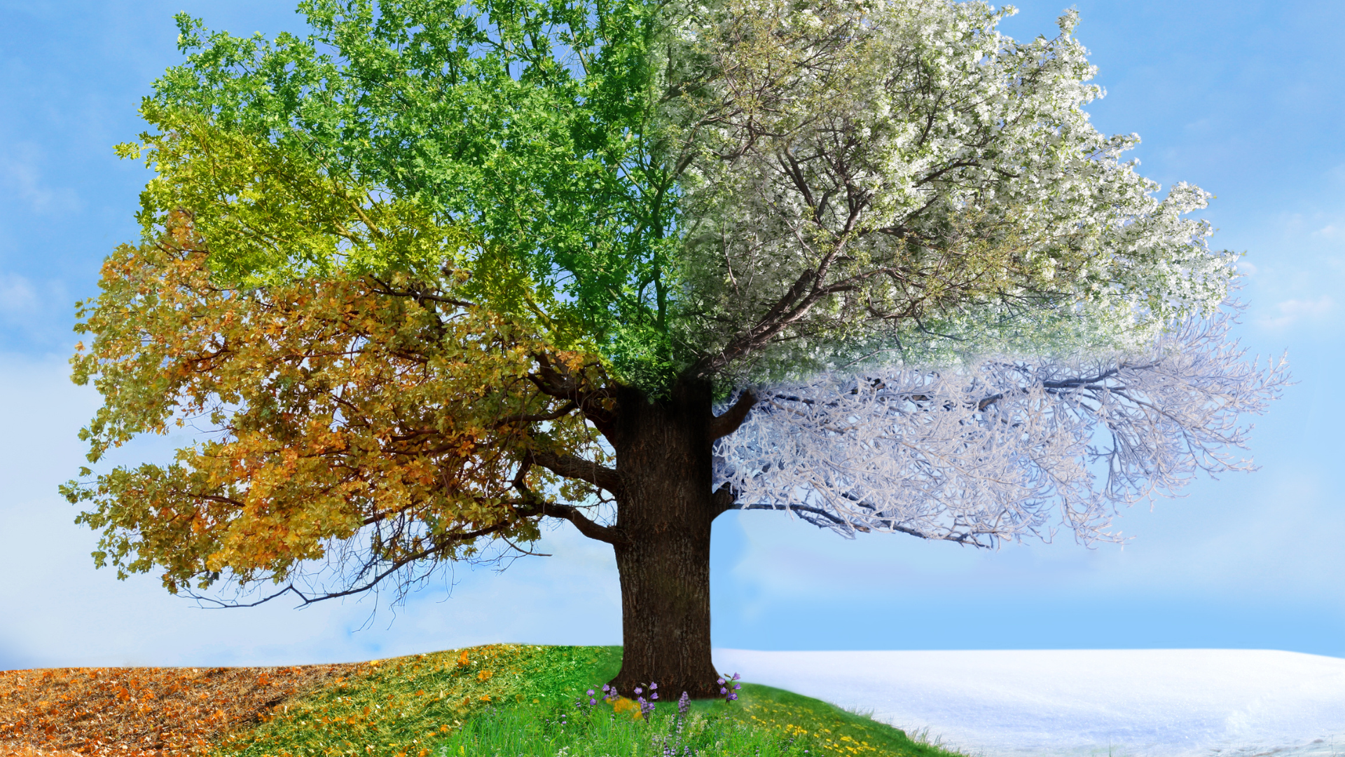
Seasonal colour analysis makes use of the changing seasons (spring, summer, autumn, and winter), each with its own colour characteristics (autumn’s earthy shades, etc).
How light reflects on earth changes the colour of every season. Thus, a new colour palette appears with every change of the season. To further explain the seasonal colour analysis, know the three colour dimensions.
1. Hue & temperature (undertone)
Colours have temperature or undertone, each tending to be warmer or cooler. However, an undertone may also be a combination of cool and warm, also called neutral.
We perceive blue, purple, and green as cool colours, while red, orange, and yellow as warm colours. For a better illustration, take a look at this colour wheel.
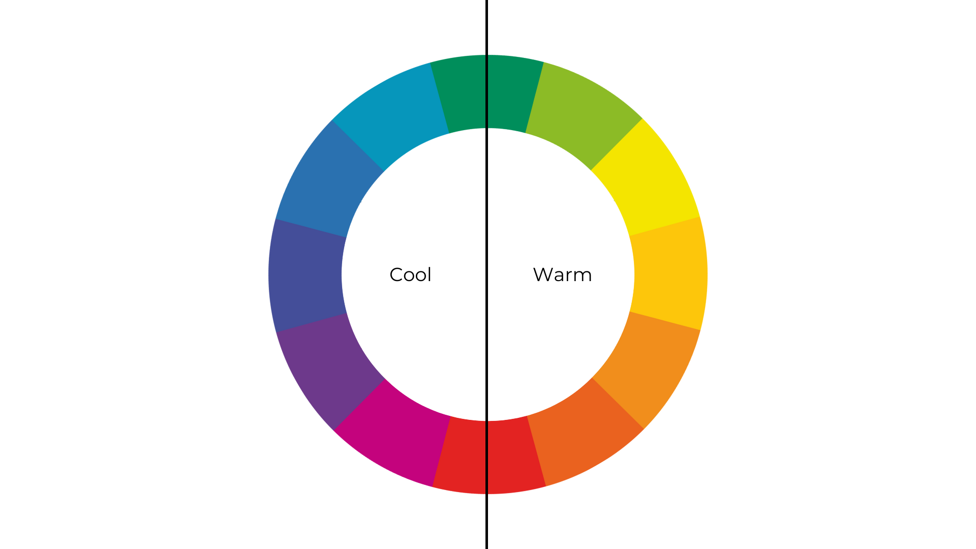
However, this doesn’t mean that all blues are cool and all yellows are warm because any colour may possess cool or warm undertones.
When yellow is mixed with orange, it becomes a tangerine yellow, which has cooler characteristics than acidic yellow.
If you use the seasonal colour analysis, you’ll generally perceive that the coolest colour is blue and the warmest one is yellow.
Cool colours are blue-based. Thus, the colour is cooler if there is more blue added to it.
Warm colour is yellow-based. Thus, the colour is warmer if the colour has more yellow added to it.

But then, you might have noticed that some colours are neither cool nor warm, and a few examples of these are red and green. It is because pure red is neither yellow nor blue, while pure green is composed of equal parts of yellow and blue.
2. Value (Depth)
Also called luminosity or lightness, value measures the lightness or darkness of a colour, but the hue is constantly held.
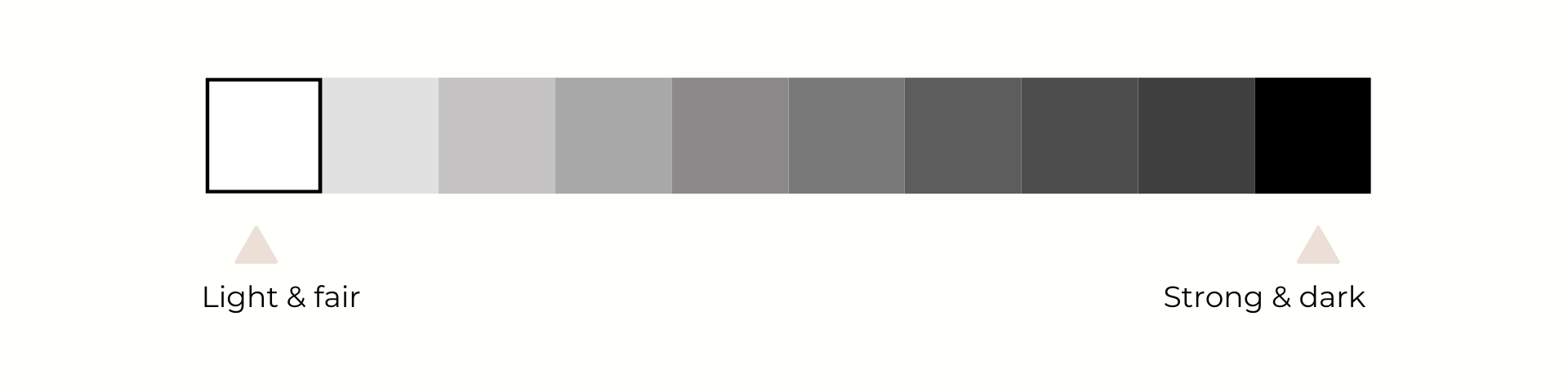
Remember that light colours are added with white, being referred to as a tint, while dark colours are added with black, being referred to as shades. Here are the two factors in determining your seasonal colour.
- The darkness or lightness of your overall colouring (e.g. hair)
- The undertone of your eyes, hair, and skin (e.g. eyes can be either golden/warm or ashy/cool)
There are four possible variations that will come out of these variations. Each season represents a variant.
For example, you’re a spring or a summer if your hair is lighter than medium brown, you’re an autumn or spring if you’re a redhead, and you’re either a winter or summer if you have ashier hair that has no red or golden highlights in it.
3. Chroma (Clarity)
Chroma refers to the saturation of colour, defining how bright or muted it is. To illustrate this further, imagine adding grey to a pure hue. This will help you figure out how saturated or clear it is.
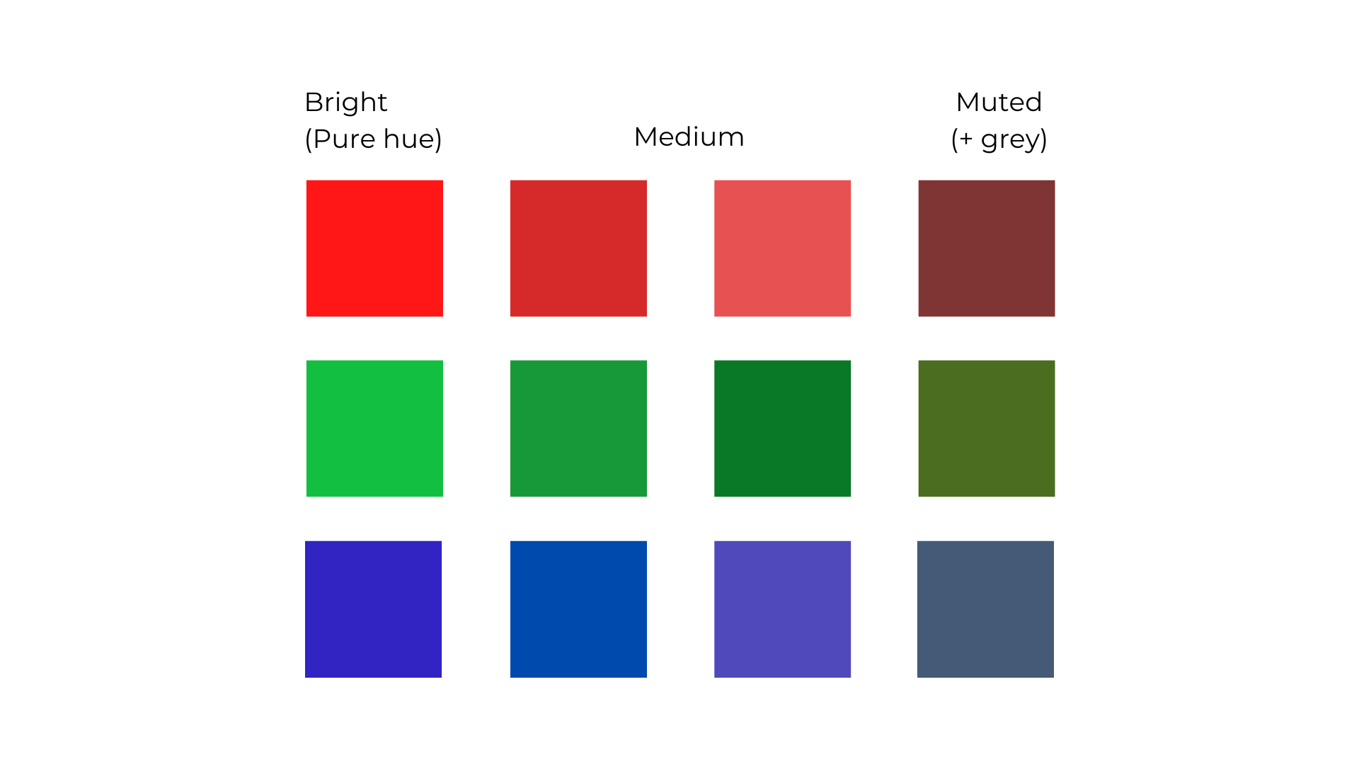
Think of this. Bright colours are not close to grey because they are saturated. When more saturation is removed from a colour, it becomes greyer, making it look more muted.
When added with grey, a colour becomes a tone based on the colour theory, stating that a tone is a pure HUE, which has neutral grey added to the colour.
Note
This is a simplified colour analysis, as my clients had found the advanced colour theory too complicated. Based on the feedback I received, the four seasonal colour palettes are enough to create colour harmony in my client’s wardrobe. Nonetheless, I’ll be writing about the advanced theory in my coming blog posts, so stay tuned.
Have you downloaded your free colour swatches? If you haven't done so, click here to download them.