How to Look Stylish Wearing Colours
Jan 19, 2023
Matching our clothes goes beyond looking fabulous and fashionable because what we wear affects our confidence and emotions. By putting together a well-coordinated outfit composed of matched pieces, you’ll feel awesome wearing it!
That’s why colour coordination is important. How we get dressed in different pieces perfectly matched and look amazing together greatly influences how we feel about ourselves and how others perceive us.
Keep reading today’s post, where I’ll share ways to incorporate colour into your wardrobe so that you can dress up to communicate your great style and use colours effectively to create a positive first impression that enhances your personal branding.
Understanding the Perception of Colours
Colour influences every aspect of life and plays a major role in it. Each colour can encourage an emotional response from other people.
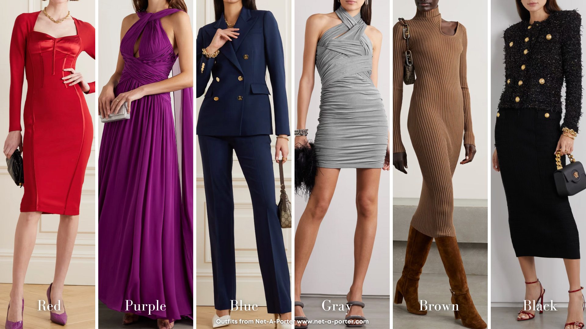
Red can make you feel passionate, courageous, strong, and aggressive, while purple can give you a sense of royalty. Meanwhile, blue is a favourite colour that makes someone come across as trustworthy, stable, dependable, and consistent.
Then, colours like grey or brown can convey conservatism, reliability, and pragmatism. On the other hand, black is perceived to be the most powerful of all colours being formal and authoritative.

Colour Combinations Using the Colour Wheel
Remember the colour wheel back in the art class? This wheel helps us understand the relationship between colours and determines which colours look exactly good together.
Take a look at the colour wheel. Notice the colour positions and ways they’re related to one another. We can consult a colour wheel to identify the relationships between colours. By learning how to create colour combinations, you can make excellent clothing matches with pieces that go well together.
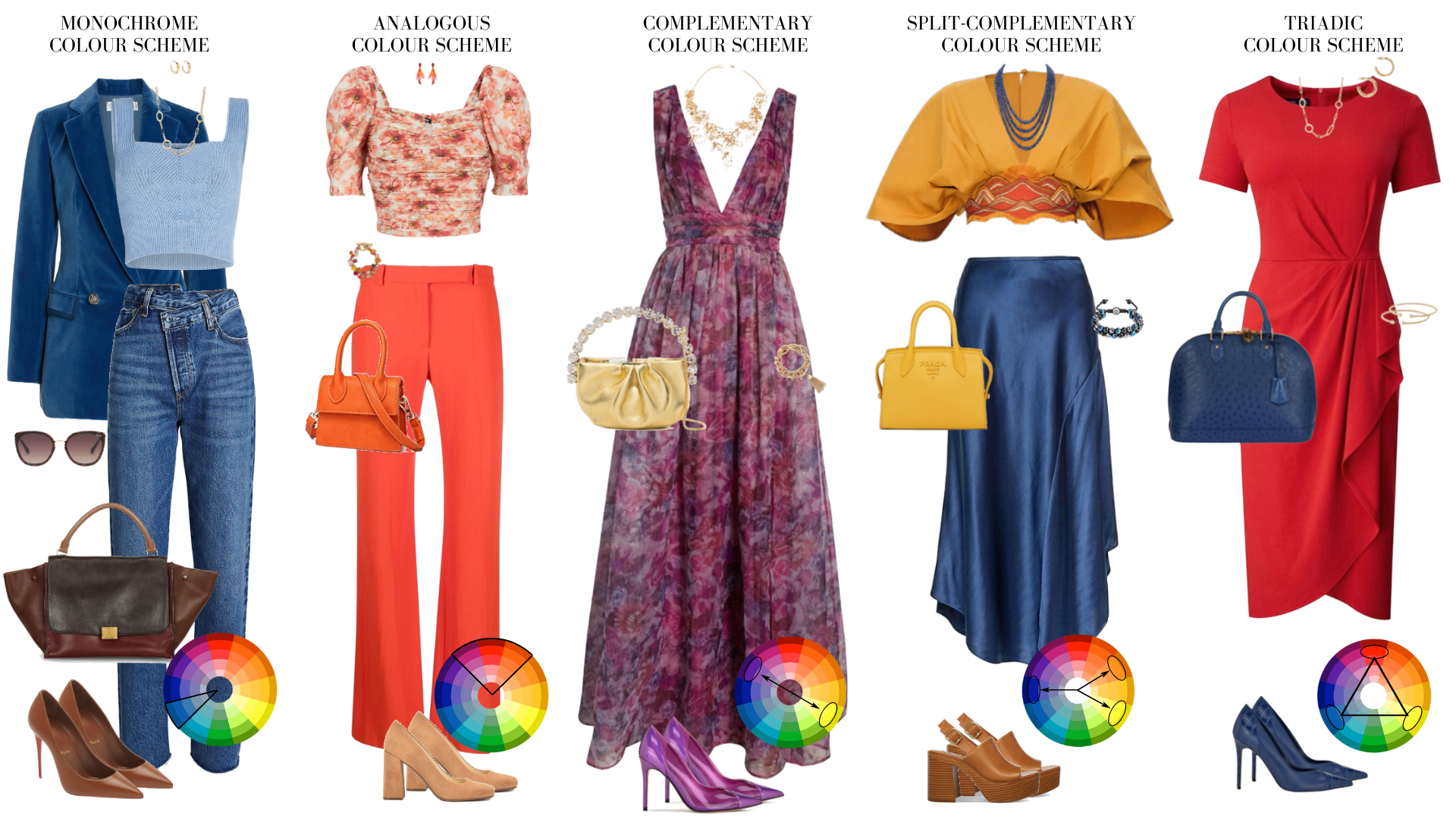
A monochrome colour combination is a different variation of a single colour and is made up of varying tints, shades, and tones. For example, dark red, slightly lighter red, and light red. These combinations are great for simplifying busy designs and creating a harmonious, visually appealing look.
Analogous combinations use colours that sit side by side directly on the colour wheel. The harmonious blends evoke calm and peace. For the best result, you choose a primary colour as a base, then choose two more to accentuate. Hence, it usually works best with a secondary and a tertiary colour. Make sure your base colour dominates and the other two colours highlight, not overpower.
Then, there are complementary colours – that are opposite of each other and that are in high contrast.
An example of this is violet and yellow. They can be great colour combinations because they look exciting and energetic; however, too much of them can be pretty overwhelming for the eyes.
The split-complementary colours are a variation of a complementary colour scheme. But rather than being a mixture of two opposite colours, split complementary colours are a combination of three colours on the complementary colour wheel. An example of it is yellow, violet, and yellow-orange.
Triadic colour schemes are variants of the split complementary colour scheme. The colours in this composition are found equally spaced on the colour wheel. An example would be red, yellow, and blue.

Using Skin Tone to Combine Colours
You can determine your best colours by examining your natural colouring and choosing the colours that complement you. Would you like to learn more? You may read my previous blood posts:
Colour Analysis: How to Wear Your Beautiful Essence Colours
Advanced Colour Analysis - 12 Seasons Colours
Tips for Using Colour in Your Wardrobe
In the following, I’ll share tips that will help you in using colours for your personal styling.
A little note: This process doesn’t take overnight to accomplish and requires trial and error to perfect it. But then, using colours will not be difficult.
- Remember that analogous colours are easy to look at and are harmonious.
- Use split-complementary or complementary colours to achieve bold looks. A little caution, they can look overwhelming when paired as the primary pieces of your attire.
- Colours like teal and coral are safe and can work harmoniously with all skin tones.
- Use no more than three colours in your outfit to prevent looking too busy and overwhelming at the same time to the observer.
- Master your skin tone so that you can match colours that work perfectly for your natural undertones, colour values, intensity and energy level.
- Maintain balance in your outfit. Don’t choose an equal proportion of colour quality.
Final Thoughts
Understanding what colours suit you and using them properly takes effort and time. Mastering the overall process will definitely take some time. For instance, you might love some colours, but they don’t look good on you. Choose colours that work better for your skin tone to achieve your best look. By knowing and using the right colour combination in your outfit, you’ll certainly feel amazing all the time.
With gratitude,


